
-
The Content App's Toolbar in detail
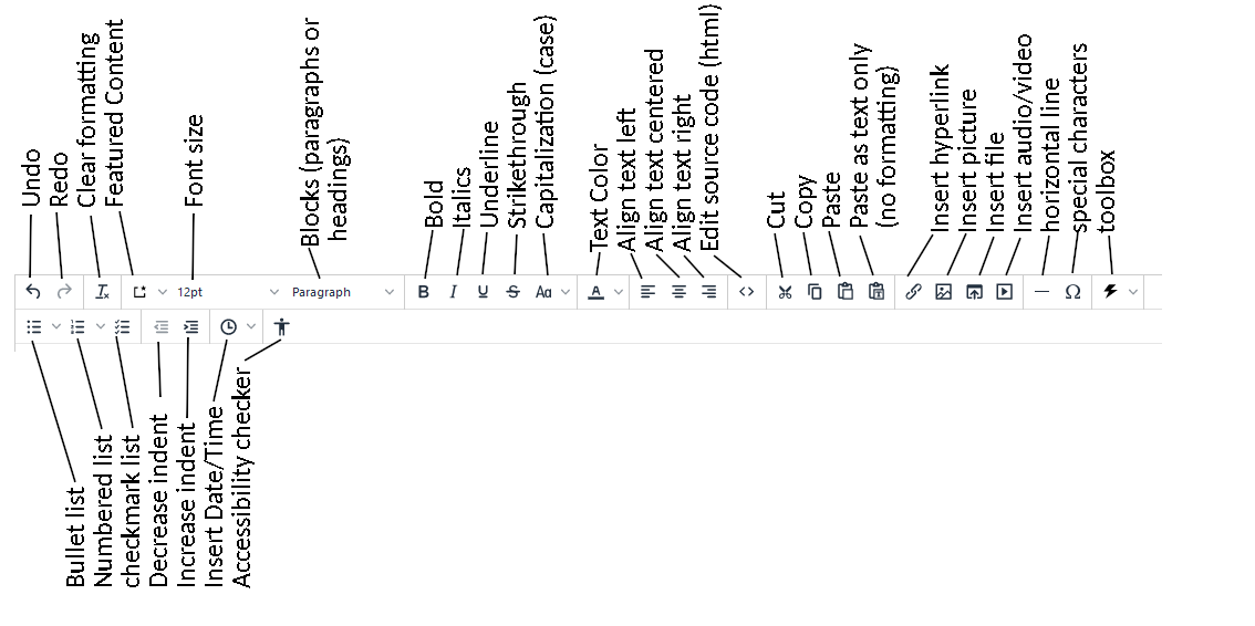
Some of the features worth noting:
Clear formatting - this works after you've pasted something in. Highlight the content and then press this button. If it came out of Microsoft Word and you paste it onto a webpage, there's a TON of bloat. This will help your page load faster on slower machines, and it improves webpage accessibility.
Featured Content - This allows you to grab some special features using its dropdown.
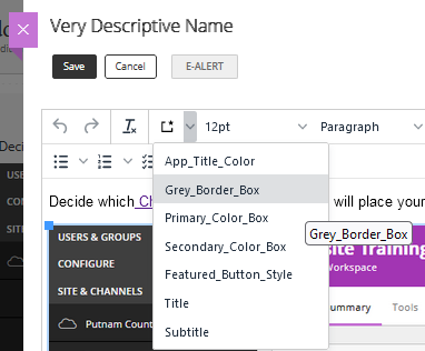
App Title Color lets you match the text to the webpage's color scheme. Just highlight the text to change color and select App Title Color.
The Grey border box can make text pop by drawing a gray border around your typed text. I guess it's grey because somebody's English...
The Primary color box uses your page's primary color. It makes keeping content tied to your page color scheme a snap.
And the Secondary color box use's your page's secondary color. It also keeps your color schemes aligned with your site.
The feature button matches your text feature, which in this webpage's case is white. Which makes it invisible on a white background, so I skipped it.
This is a Title
This is a subtitle
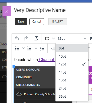
Font size is a drop down menu.
If you want 13-point font, you're out of luck.
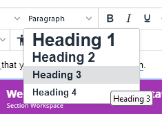
The Block menu lets you pick a heading style from one to four.
This text is the standard paragraph text. I'm using Heading 3 for the heading above this text, if that matters to you.
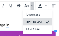
The capitalization menu allows you to manipulate text case.
TYPING IN ALL CAPS IS CONSIDERED SHOUTING ON THE INTERNET. It's poor netiquette. I'm sorry for my poor behavior, but I have to demonstrate bad manners to show what bad manners are.
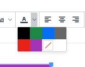
The color picker is deliberately limited.
For accessibility, text must have a contrast ratio of 4.5:1 (see 1.4.3 Contrast (Minimum)). Unless you do math for fun, this limitation will keep your text in compliance.
The white box with a red slash in it removes a color. Your text can be black, green, blue, gray, red, or purple. The colors pop better with bold: black, green, blue, gray, red, or purple.
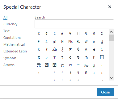
The Special Characters drop down can be useful.
You can pick from all or categories. The text category has copyright symbols, © as well as TradeMarks™. The quotations section oddly includes fractions ¾. But if you need an upside down question mark for asking "¿Que Pasa?" they've got you covered.
The Tool Box
I suppose if you need to timestamp a document, this could be helpful. Saturday, July 27, 2024 5:19:55 AM
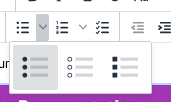
The Bullets Menu
- I can use filled circles
- or opened circles (but they are hard to see)
- or filled squares.
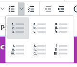
For numbered lists, the dropdown allows you to choose from Arabic, Roman, and Alphabetical style choices.
Make your English/Language Arts teacher proud with a proper outline.
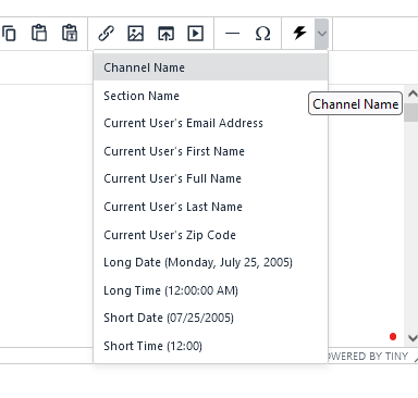
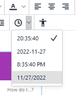
The Insert Date/Time function seems to step on the Toolbox's territory.
If you really need dates or times, this is a shorter and more direct list. But use whatever makes you comfortable.
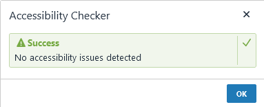
That "little man" icon at the end allows you to do an accessibility check. If there's a problem, the checker will point it out. I used CSS to make pink text; It wasn't accessible, so I changed it:
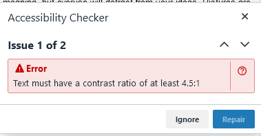
Once I fixed it, it gave me a green light that everything was good.
Select a School...
Select a School
- Algood Elementary School
- Algood Middle School
- Avery Trace Middle School
- Baxter Primary School
- Burks Elementary School
- Cane Creek Elementary School
- Capshaw Elementary School
- Cookeville High School
- Cornerstone Elementary School
- Jere Whitson Elementary School
- Monterey High School
- Northeast Elementary School
- Park View Elementary School
- Prescott South Elementary School
- Prescott South Middle School
- Sycamore Elementary School
- Upperman High School
- Upperman Middle School
- VITAL (Putnam County Schools Virtual Instruction to Accentuate Learning)
- White Plains Academy